Welcome back & thank you all who just joined VIEWFINDER.
In this release, we will go deeper into the choices we made when shaping KEIRIN.
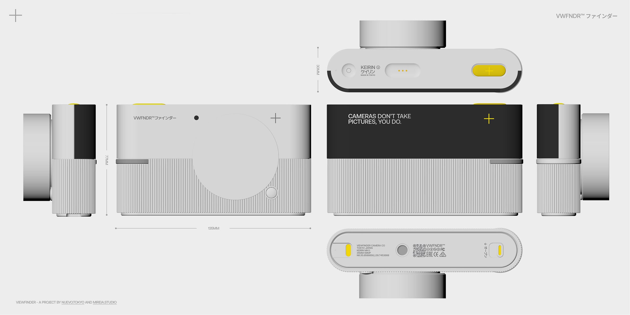
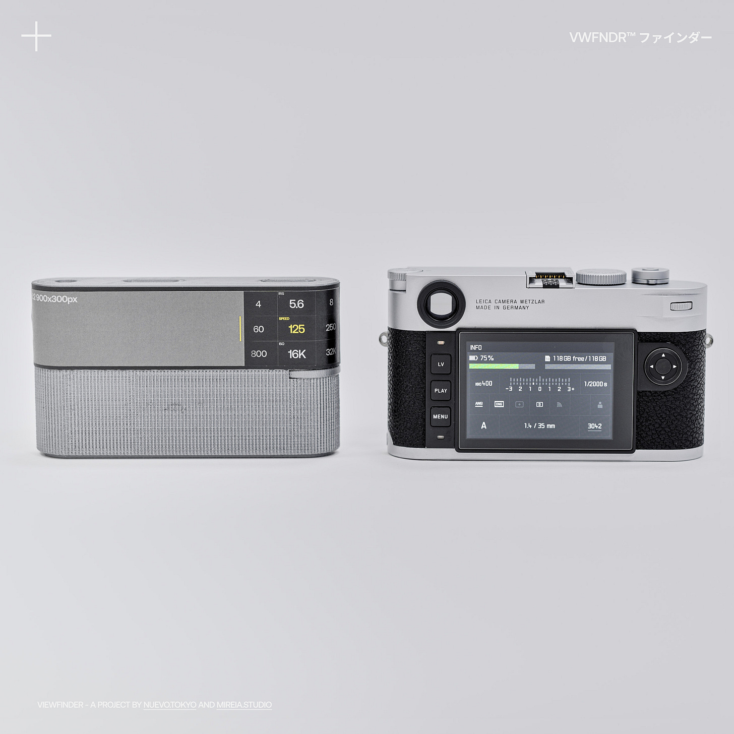
In a world flooded with digital imagery, we wanted to put in the work to thoroughly design the proportions, the size and the overall feel of the camera in hand. Through several iterations of physical prototyping, we’ve double-checked and reworked our assumptions until reaching a good balance between ergonomics, screen real estate and aesthetics.
Handling & Ergonomics
We often ask ourselves, why design another physical camera? It might seem like an act of nostalgia but the physical interaction of shooting with a well-crafted device is a very satisfying experience, one that has been lost with smartphone photography.
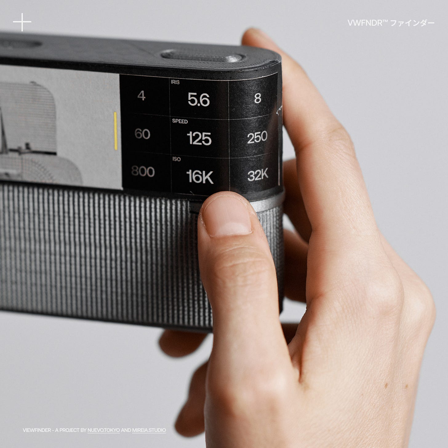
We are aiming to create a camera that fits effortlessly in your hand, can be held in multiple ways without obstructing the buttons or smudging the screen and allows you to use both thumbs to interact with the interface and physical buttons. Becoming more like a gamepad than a classic camera.
“The best camera is the camera that is with you” - is our motto. Sturdy but light, KEIRIN fits smoothly in your hand or hangs gently from your neck, without it being too heavy or too fragile.
The pill shape is a recurrent leitmotiv across the design language. It is defined by the softening of the corners on the vertical edges, guided by an ergonomic choice, not an aesthetic one. Similarly, the elongated shutter button accommodates several finger lengths, giving each hand a more flexible shooting position than with a typical circular shutter button.
The rest of the camera language follows a playful language of halving the geometry to separate parts by use. Half screen, half grip. Half smooth, half textured. Half front, half back.
While secondary, lots of aesthetic considerations are being made while designing the camera. We are aware that beautifully crafted objects have higher perceived value, therefore used and kept for longer. We want to think that Keirin walks the line between designing a beautiful object and making a lot of sense.
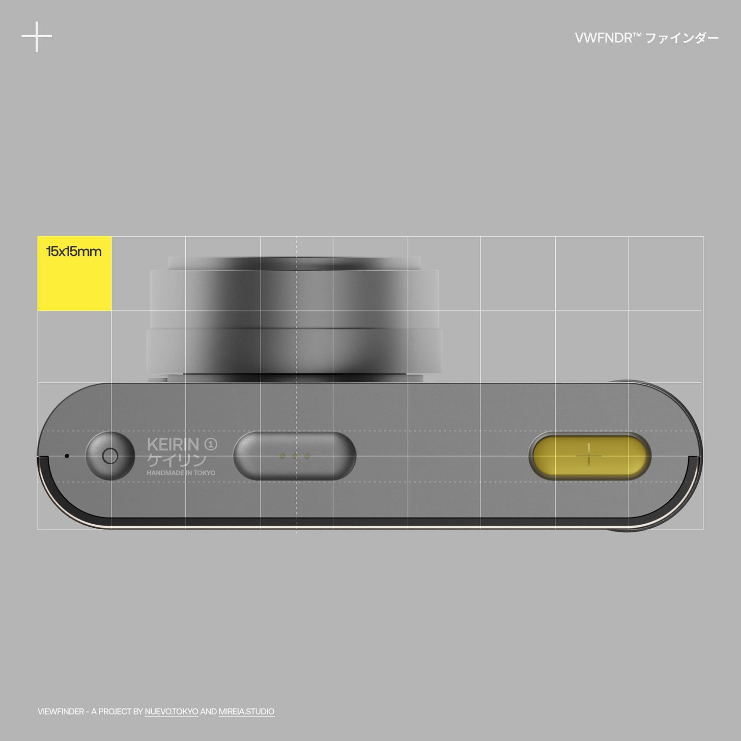
The volume and visual balance of both the camera body and the interface designs are guided by a grid of 15*15mm. Enabling a seamless connection between the physical and the digital experience.
SCREEN
Working out the right screen size is a balancing act. The tendency is to think that a bigger screen is always better, but that would turn the camera into a slippery bar of soap. We compromised on screen height to provide a clear grip for big and small hands, sweaty palms or when using gloves.
At the same time, since this is a panoramic-first camera, the screen benefits from a super wide ratio, being able to fit both the viewfinder and shooting controls next to the other.
When put side-by-side with similar-size cameras, KEIRIN has generally a 2x~3x more tappable surface to interact with UI, while having enough vertical grip to hold the camera without obstructing or “mistapping” the screen.
ID & UI SYMBIOSIS
Looking at Keirin, the reduction of physical buttons is evident. Most digital cameras still include somewhere between 6 to 20 buttons on the body, mainly to aid convoluted menu navigation as well as poor touch screens, prompting interfaces that are closer to designs of the 1990s than the 2020s.
While we appreciate the need for physicality, we wanted to leave just the minimum-necessary physical buttons and design a layout that you can’t possibly touch by accident while trying to shoot. In Keirin, each physical button has a specific function, but also, it can be customised to your taste.
There is also an intentional “function redundancy” between what you can do on the screen and with the physical buttons, i.e. you can either touch-and-swipe the screen to change ISO or click-and-rotate the dial to do the same.
We are aware that each photographer has different ways of shooting and we want to allow them the flexibility of choice, within a minimal and opinionated layout.
KEIRIN is a camera designed to marry both hardware and software, so interactions, whether physical or on-screen, feel seamless and we dare we say, natural.
WHAT’S NEXT
We are preparing the upcoming releases:
004 - UX & Interface Design
005 - Accessories & Connectivity
…
Stay tuned & keep shooting 💥
CREDITS + OMISSIONS
Thank you to Adam Esposito and Brian Schwind in Tokyo, for being patient with us and helping make multiple 3D prints.
In our last newsletter, we missed crediting our man Christoffer Morales in Sweden for his animation work, thank you! + He is also working on more animations for upcoming issues! Just saying…
VWFNDR is an open project for like-minded creators passionate about photography, please get in touch below with feedback or to get involved!
VIEWFINDER - A project by Nuevo.Tokyo and Mireia.Studio
UX/UI/Ideation → Alvaro Arregui Falcon
Industrial Design/Ideation → Mireia Gordi i Vila


